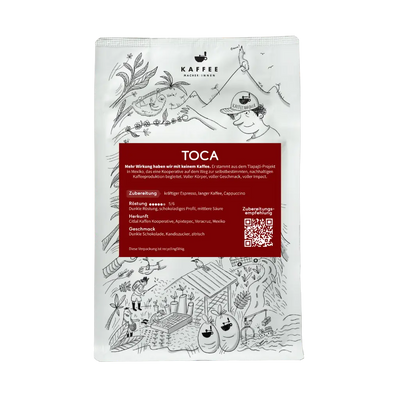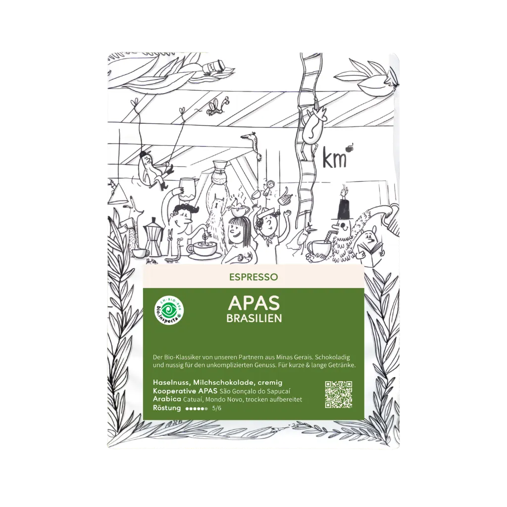

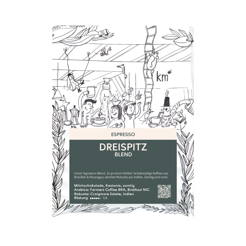

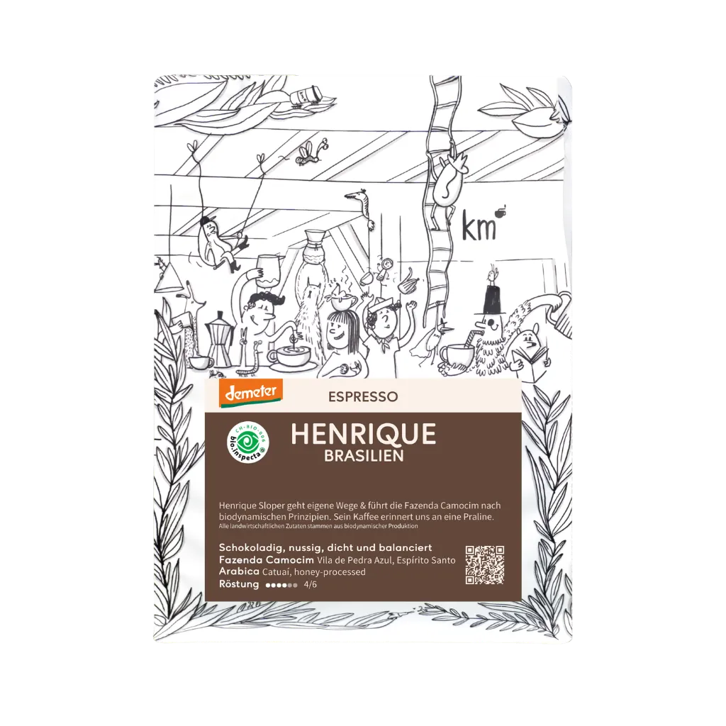

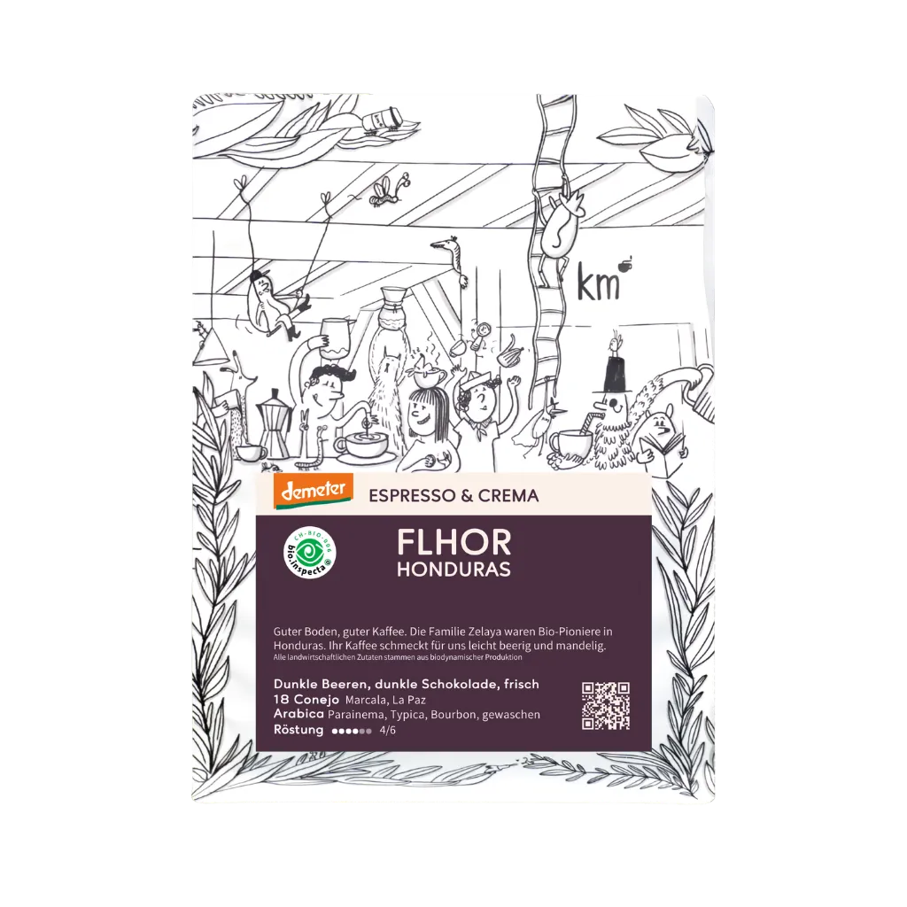



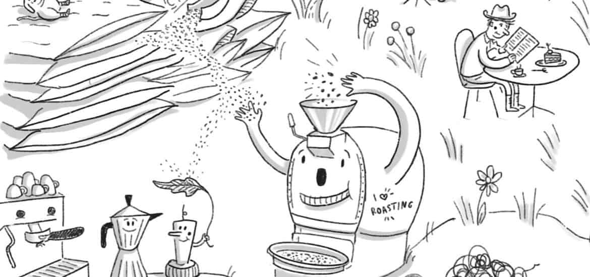

Our coffee bags were illustrated by artist Mara Berger. On the bags, we tell the journey of coffee with a wink. A look back from the beginning of our packaging to the status quo.
In January 2017, we started Spring Roasters roastery as a project of Kaffeemacher GmbH. Spring Roasters was the roastery with which we could also supply our own café Frühling – hence the name.
Somewhat later, in the name of was added, our second project, under whose name we carried out custom roasting for third parties. We continue to do these roastings, but as Kaffeemacher Roastery. In May 2019, we finally communicated that we were merging the two projects. Since May 2019, we have been Kaffeemacher Roastery.
A Look Back at Our Packaging
In order to reflect these internal developments, we wanted to communicate this externally with a new identity. But before we discuss the new bags, let's take a quick look back at how it all started.
The Beginning (2017)

Simple and clear was the initial motto. A blossom and a branch from a coffee tree, plus a simple lettering. That's how we started launching the Spring Roasters brand.

Since early 2017, we have been using the black bags from Stroebel Eco-Line without aluminum coating. Today, we continue to pack private label coffees in these bags.
More Info (2017)

By the end of 2017, the reduced label was no longer sufficient to tell more about the coffee. We wanted to share more about the origin and processing methods. We put this information on an extra sheet.
More Color (2018)

We roasted more and more coffees and began to associate tastes with colors. At the same time, more calm came to the label, as a clear separation of color and plant was now made. We also modernized the typeface.
Everything New (2019)
And now, in 2019, everything is new. The coffee plant from the first package served as our inspiration to continue using a sketch-like drawing style. Only everything else around it should be new.

Our Rebranding Process
Every rebranding process offers opportunities. With the new bag and the new coffee identity, we wanted to show how we understand specialty coffee. Over the last eight months, we have intensively engaged with our identity and our values.
Minimalist or Wild? Very Wild.
For us, specialty coffee is not exclusively about taste, but also about the approach of how we want to treat coffee and the people connected to it.
Specialty coffee is diverse, no coffee operation is exactly like the other. Just as there is no the coffee producer, there is no the roaster. We wanted to express this diversity. We brought on board Mara Berger / moktokillustration (https://www.instagram.com/moktokillustration/ ) because we greatly value her work.
Mara manages to tell big stories in small spaces. And that was exactly what we wanted.
With Mara, we wanted to show a general coffee story from A to Z, starting on the farm, and now on the front of our new bag.

The front shows a coffee farm, a dense plant world, a smiling coffemaker clumsily picking coffee, someone fertilizing coffee, the animal world and characters that should appear again and again.
We are all fans of Where's Waldo? and so the idea of a busy picture wasn't far off for us. Today, much is simple and elegant. We wanted to show coffee the way it is for us – wild, lively, and somewhat chaotic.
In the upper part, we immortalized our partners from Boca de Lobo in Nicaragua:

The wolf (lobo) is the logo of Claudia's and Tim's Projekt, to host volunteers for a time on a coffee farm and to learn about the community, about coffee and life on the ground.
Coffee from A to Z
We roast the purchased green coffee in Münchenstein, pour it in our Café Frühling in Kleinbasel and now also at the SBB train station Basel, or we sell it in our shop.
On the back of the package, Mara has illustrated these further stages of the coffee chain.

The roasting machine (Diedrich) is delighted, the brewing methods too, we taste coffee, the guests are satisfied and the dog on the catering bike is also in a good mood.
Coffee is not a perfect world, we know that. But coffee is emotional. And we wanted to do justice to this emotionality of the product.
The MokTok Character
Many artists have their favorite character. A figure that appears again and again somewhere, even if in modified form. We firmly believe that Mara has incorporated her favorite character on one side of the package. Here, he tries his hand at latte art.

A Bit of Fun
Sometimes we think coffee comes across as too simple and super premium. So we wanted to have a bit of fun with it.
And anyone who wants to can color in the bag, whether large or small.
The Labels and Coffee Info
We discussed at length how we wanted to communicate coffee knowledge. On one hand, we want to explain why we particularly like this coffee. On the other hand, we risk overwhelming someone with too much information and data.
So we decided on simple labels (as a contrast to the wild packaging) and coffee info cards. Salome, our Coffemakers graphic designer, designed both. Now we have a consistent form and color language, which makes the entire range appear cohesive.

For the Coffee Info We decided on an info card with two options. The front is for the quick check, "what kind of coffee is this?", the back is for a deeper engagement with the product.

The Coffee Barometer
To make it easier to get into the world of coffee, we decided on a coffee barometer. It swings back and forth between comfort and adventure depending on the coffee.

When designating what we should call these two coffee styles, we drew on the concept of a roastery that unfortunately no longer exists today: Handsome Coffee Roasters in Los Angeles, CA.
The distinction between comfort and adventure is meant to help you find what you're looking for more quickly and get a feel for the coffee.
Comfort: these are coffees that pick you up. Coffees that taste like coffee. Coffees whose flavor is familiar, yet still stands out distinctly from the crowd. Coffees that make you want many more cups, coffees that don't need much head cinema, but just fulfill their purpose: bring joy.
Adventure: these are coffees that are different. Coffees that demand some imagination. Coffees that surprise, perhaps uncomfortable, but always mind-expanding. Coffees that don't hide their character. Coffees whose task it is to look beyond the sensory horizon and see the unknown.
Looking Ahead
The discussions we've had were sometimes emotional, as they were about what we do every day. With the new bags and new design, we want to express what we love. What we do every day, what makes us happy.
We would like to sincerely thank Mara Berger / moktok illustrations for the great collaboration. The bags have truly become unique. Our Salome then completed them with simple labels and postcards.
We're ready for the next steps and look forward to releasing the wild bags into coffee freedom. Take care.